LogoTypes,Aesthetics&ColorPalettes
A strategic, visual-first reference to understand logo architecture, brand personality, and color systems. Designed to help founders and teams make confident, long-term identity decisions rather than aesthetic guesses.
Logo Architecture
Choosing the right structure is the most critical decision in your visual identity process.
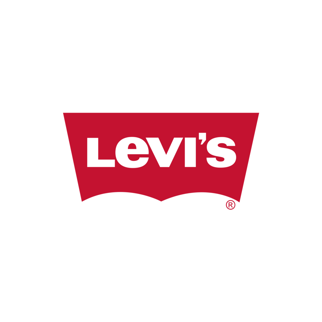
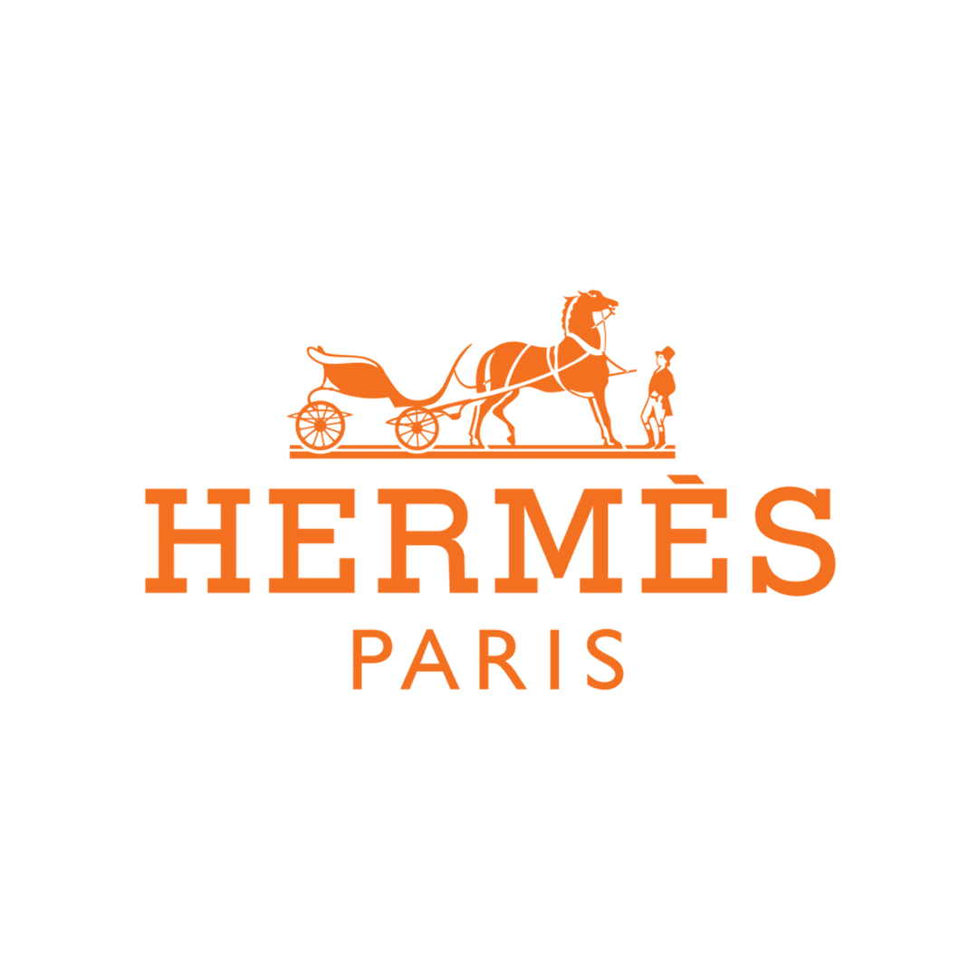
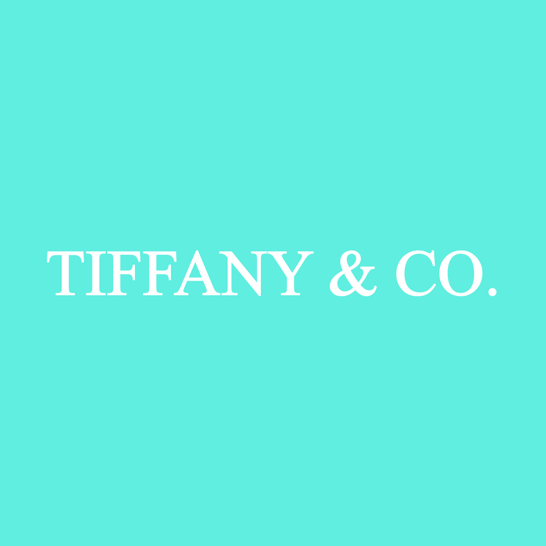
Wordmark
A typographic logo that relies entirely on the brand name. Its success depends on letterform design, spacing, and proportion rather than symbols or illustrations.
Strategy
- • The brand name is short, distinctive, and easy to pronounce
- • Typography is intended to carry the brand's personality
- • Doesn't rely on symbolism
Aesthetic Tone


Lettermark
A condensed identity built from initials. Lettermarks reduce long or complex brand names into scalable, repeatable visual forms.
Strategy
- • The full brand name is long or difficult to recall
- • Initials are already used colloquially
- • The logo must perform at very small sizes
Aesthetic Tone


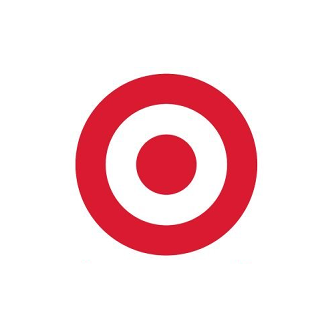
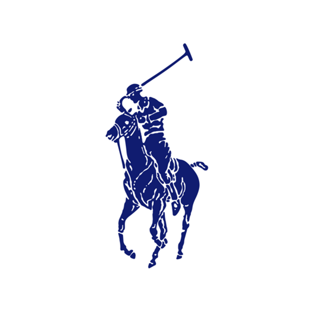
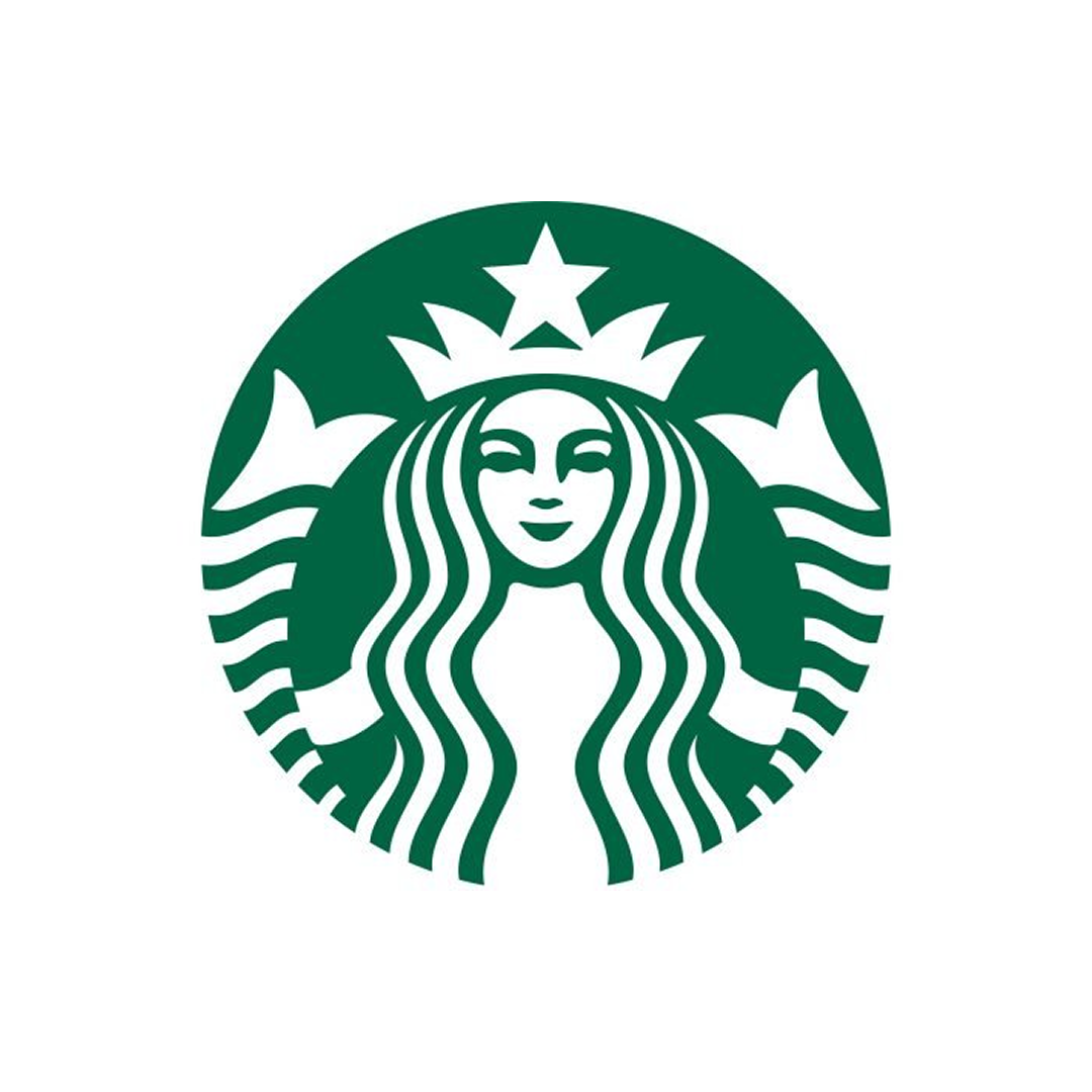
Pictorial
A symbol-based logo that represents the brand through a single, recognizable visual form. Over time, the symbol itself becomes the brand.
Strategy
- • The brand already has or plans to build strong recognition
- • Global or language-independent communication is important
Aesthetic Tone


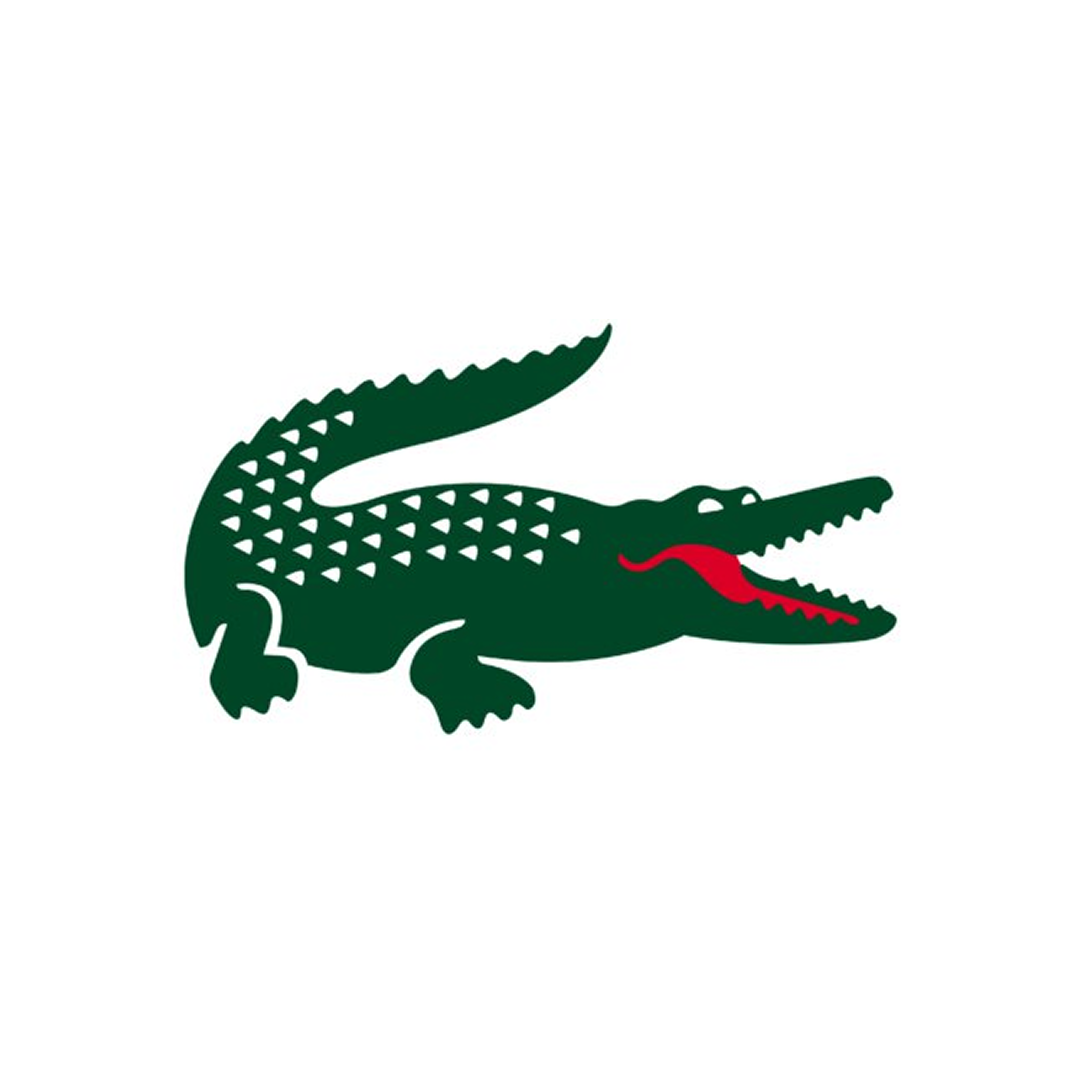
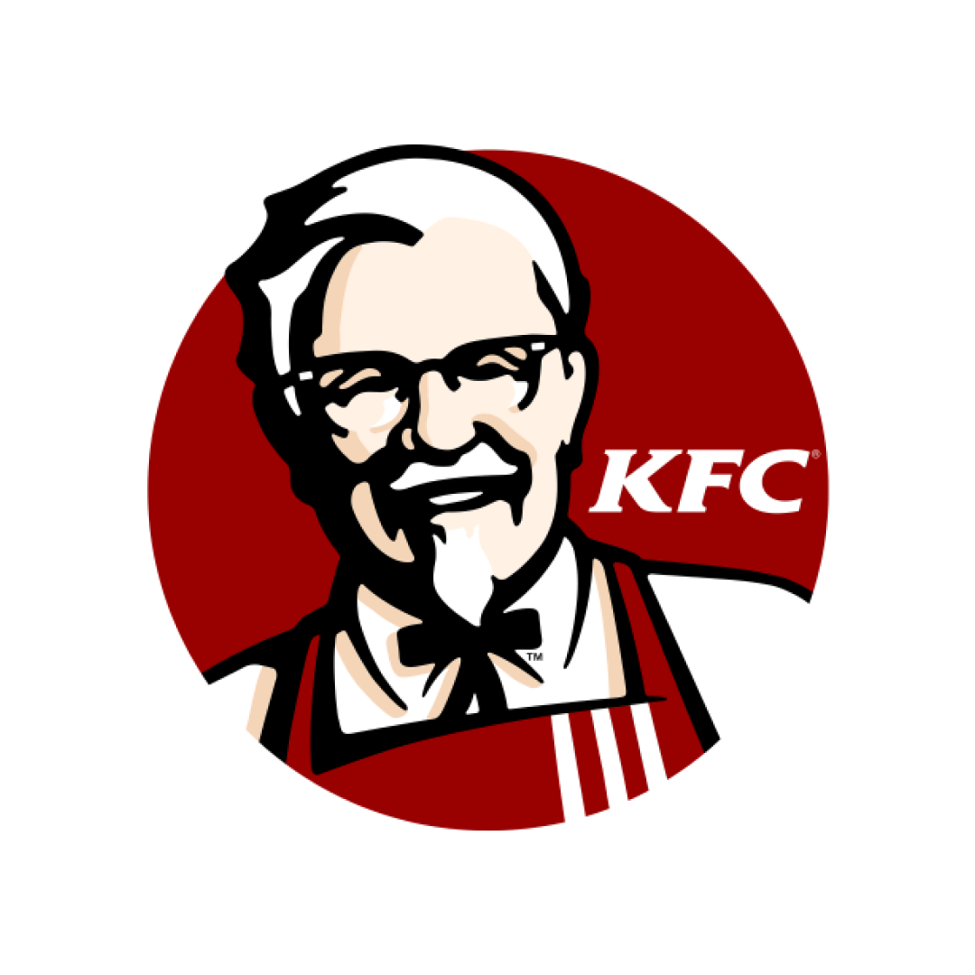
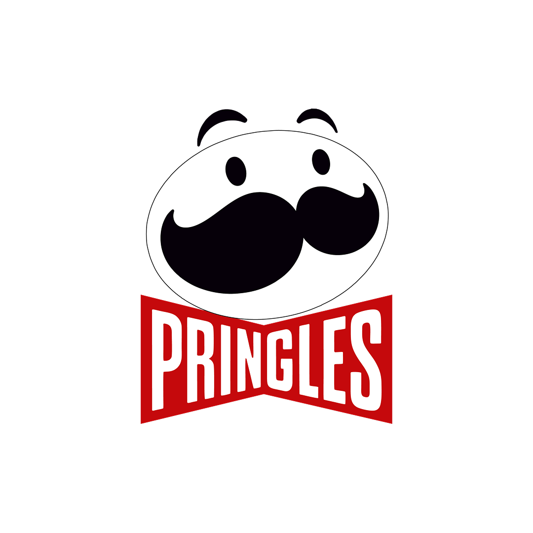
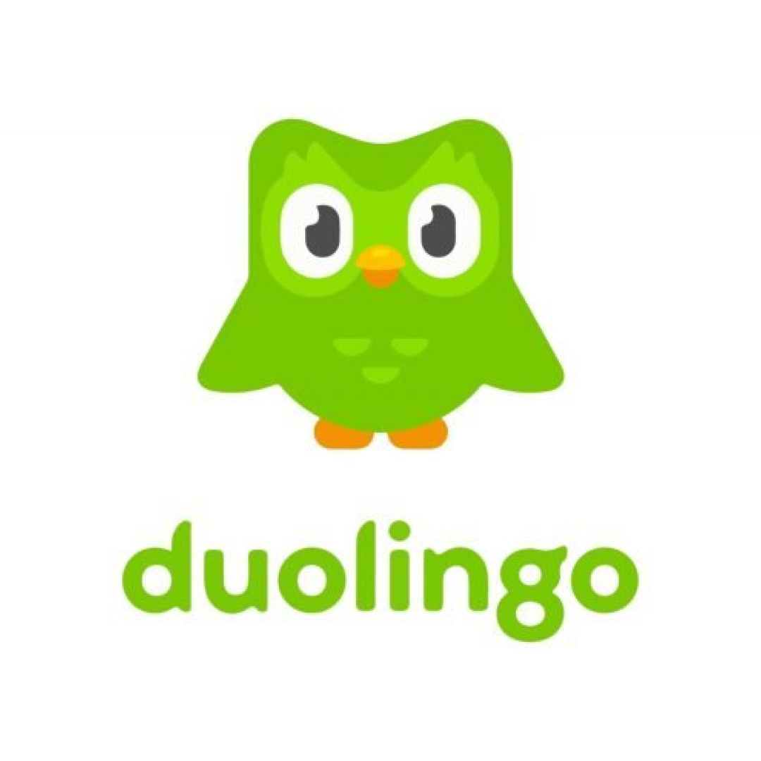
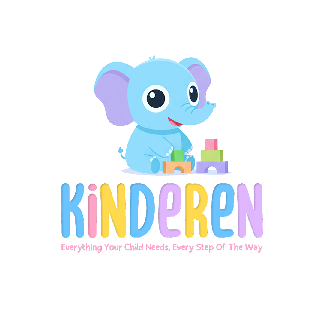
Mascot Based
A character-led identity that humanizes the brand and creates emotional familiarity through repetition and storytelling.
Strategy
- • Community-driven or entertainment-focused brands
- • Audiences that respond to personality over authority
Aesthetic Tone
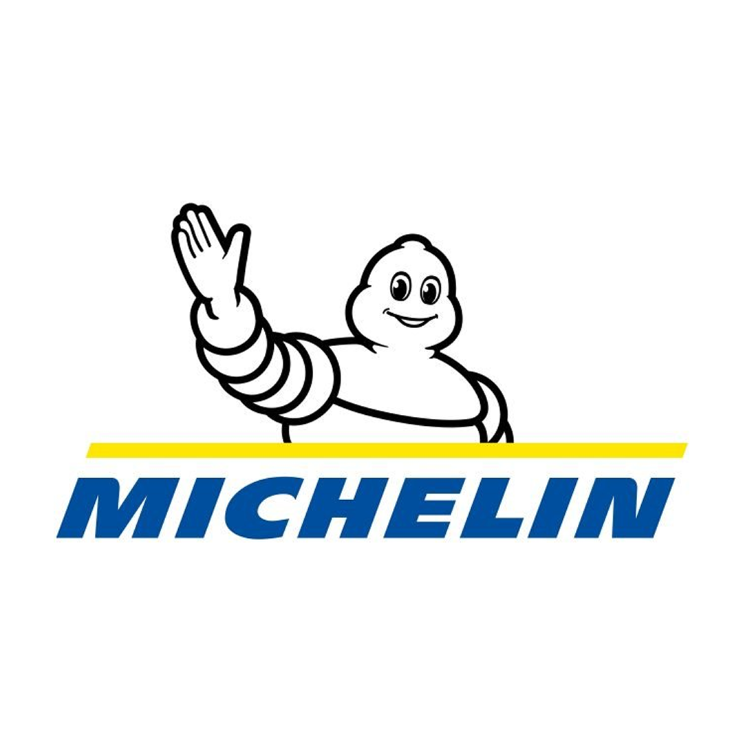
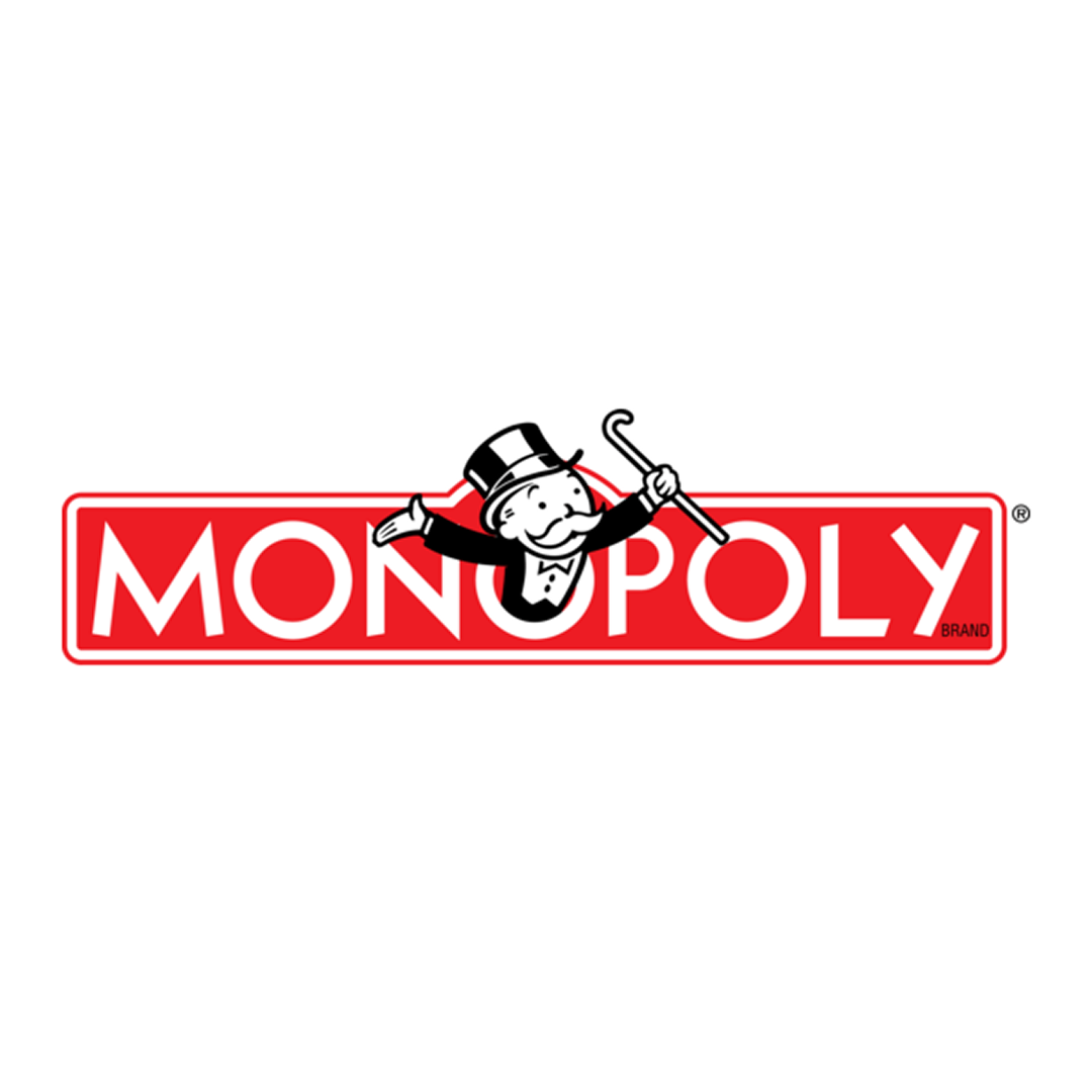
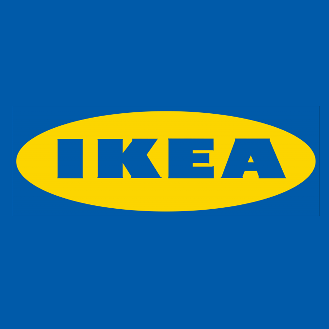
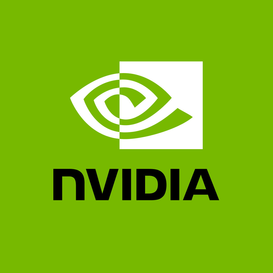
Combination Mark
A logo combining text and an icon or symbol creating a flexible system. Can be used with or without the text or symbol.
Strategy
- • Brand wants flexibility
- • Easy recognition across platforms
- • Brands that need adaptability across formats
Aesthetic Tone

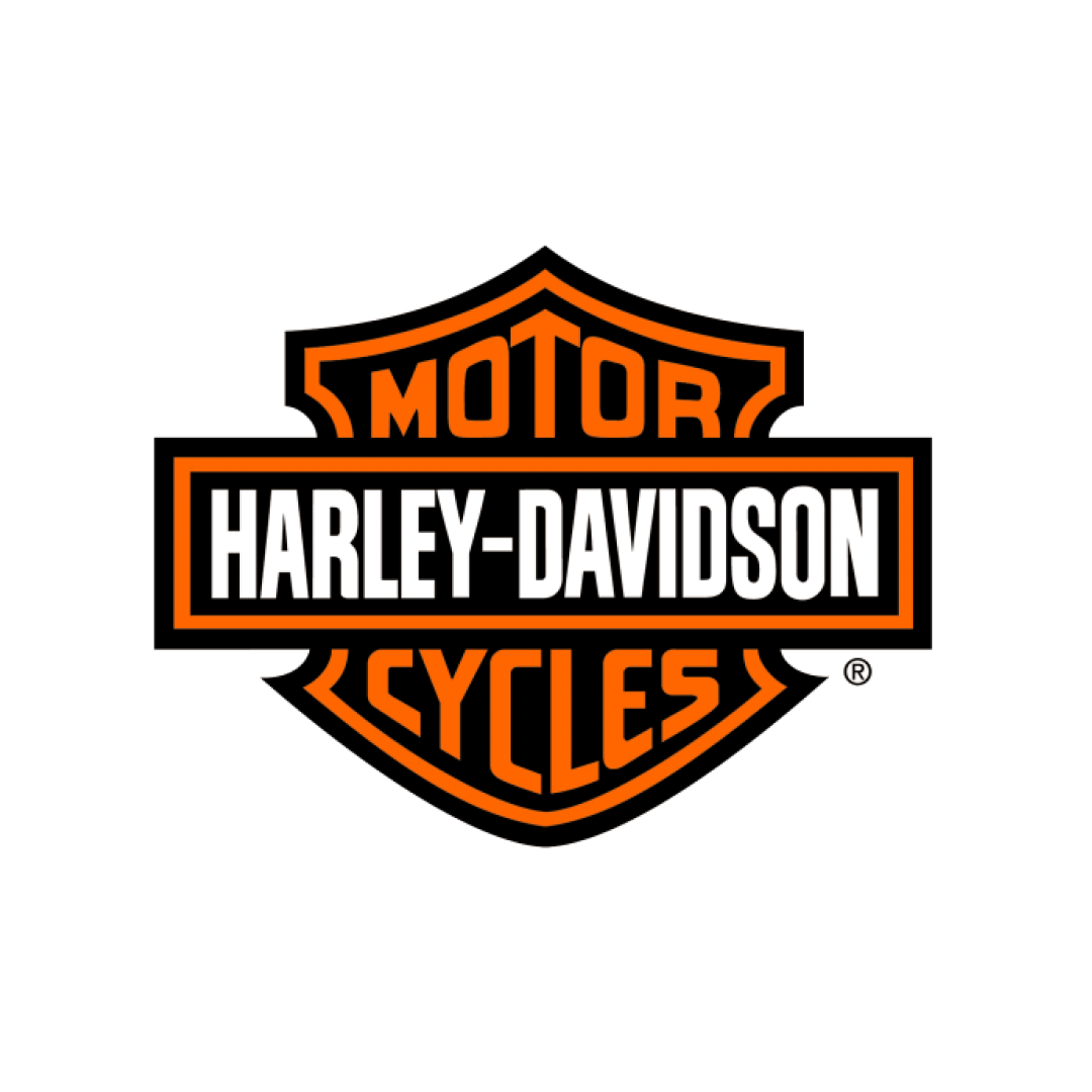
Emblem (Badge)
A contained logo where text and symbol are inseparable. Emblems prioritize authority, tradition, and formal recognition over flexibility.
Strategy
- • Strong traditional identity
- • Brands rooted in heritage or institutional trust
- • Applications where prestige outweighs scalability
Aesthetic Tone

Brand Personality
Defining the emotional core of your brand through visual traits.
Playful
Emotion-first and human. Playful brands prioritize approachability and engagement over authority or formality.
- Youth-focused brands
- Entertainment products
- Emotional branding
- Trust is critical
- Serious contexts
Professional
Structured, reliable, and credibility-driven. Focused on clarity, consistency, and trust.
- Corporate brands
- Finance/Consulting
- B2B services
- Emotional expression is key
- Lifestyle-focused audiences
Bold
Confident, high-impact, and attention-driven. Built to stand out instantly in crowded spaces.
- Sports brands
- Streetwear
- Competitive markets
- Premium positioning
- Subtlety is required
Luxury
Refined, restrained, and timeless. Designed to signal exclusivity through minimalism.
- Luxury fashion
- Premium services
- Heritage brands
- Frequent promotions
- Casual tone
Modern
Clean, efficient, and forward-looking. Optimized for digital-first products.
- Tech startups
- SaaS products
- Digital ecosystems
- Heritage focus
- Decorative storytelling
Retro / Vintage
Nostalgic and character-rich. Creates familiarity and warmth through historical references.
- Food & Beverage
- Lifestyle products
- Heritage storytelling
- Futuristic products
- Cutting-edge tech feel
Color Strategy
Strategic approaches to color selection for maximum impact.
Single Color Branding
One dominant brand color used as the primary identifier. All other colors exist to support hierarchy, not identity.

Two Contrasting Colors
A deliberate use of contrast to create energy, separation, and immediate recognition.

Multi-Color Palette
A structured color system where each color has a defined functional role rather than equal importance. Can be contrasting, can be shades of the same color.


Palette Styles
Timeless combinations organized by brand direction.
Neutral / Minimal
Calm, timeless, sophisticated
Luxury brands, architecture, fashion
Steel / Slate
Professional, modern, reliable
B2B, enterprise
Monochrome Core
Editorial, confident
Personal brands, portfolios
Bold / High Contrast
Confident, striking, energetic
Sports brands, youth-focused brands
Sunset Accent
Energetic, expressive
Media, marketing
Electric Violet
Futuristic, experimental
Creative tech, music
Creative Contrast
Bold, artistic
Agencies, designers
Heritage Blue
Clean, scalable, intelligent
Luxury, finance, real estate
Ivy Green
Established, discreet, premium
Heritage brands, institutions
Old Money Brown
Warm, traditional, refined
Luxury goods, hospitality
Luxury Blue
Elite, trustworthy, timeless
Luxury, Jewelry
Royal Maroon
Regal, serious, premium
Education, law, institutions
Muted Rose
Modern, refined, creative
Studios, boutique brands
Midnight Purple
Innovative, premium, bold
Startups, Web3, gaming
Earth / Organic
Natural, grounded, honest
Sustainability, food, wellness
Neo Mint
Fresh, modern, optimistic
Health tech, startups
Palette Playground
Experiment with harmonious schemes. Click a swatch to lock it.